ExplicaOnline

We entered into a collaborative partnership
with ProtesteCasa to create an outstanding
website for its real estate services.

> Overview

ExplicaOnline’s mission is to be the link between students and teachers. It offers an easy and reliable way to find and meet with an online teacher, receiving support on any subject at any time. The overarching goal was to create a virtual platform that would provide superior educational resources and engage both groups effectively.

> Services Provided

Branding

UX/UI

SEO Optimization

> Design Process

Research

In the initial phase of our research timeline, we conducted user research, competitor analysis, and a content audit ensuring an holistic understanding of user needs and existing content assets.

Defining Goals

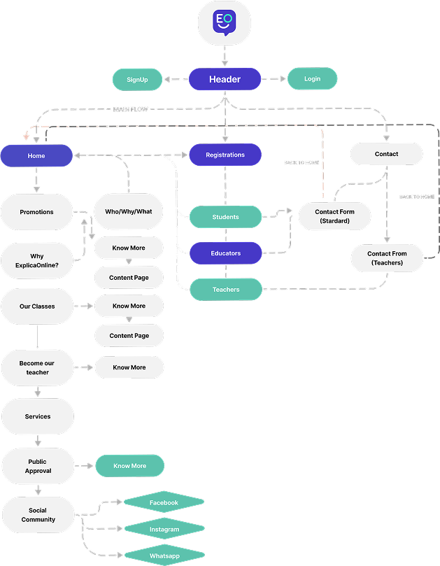
Our focus extends to empathizing with users while intricately crafting the information architecture to establish a useful interface.

Prototyping

Elaborate and integrate visual design elements into the wireframing process, shaping a tangible and aesthetically refined representation of our user interface.

Launch

Implementation, incorporating user testing both pre-launch and in the post-launch period to ensure ongoing refinement and optimization.

> Research and Benchmark

We looked for competitors targeting a similar audience or offering similar courses, then analyzed and improved the user journey, experience, and registration and onboarding processes.

> Emphatizing

To develop a website that satisfies its users, we analyzed the educational ecosystem, examining the perspectives of students, parents, and teachers. Our team considered factors such as academic goals, learning preferences, concerns, and technological proficiency.

> Branding Ideation

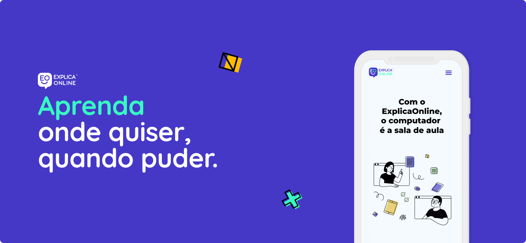
Our mission was clear: to enrich the ExplicaOnline experience with an intuitive brand style and message that sparks and amplifies the joyful fun of learning anytime, anywhere.

Learning should be a source of joy and inspiration, and that's precisely what we pursued with the visual design update. Our approach was to animate and cultivate the joy and fun of learning with an extended color scheme, comic-style illustrations and vibrant iconography.
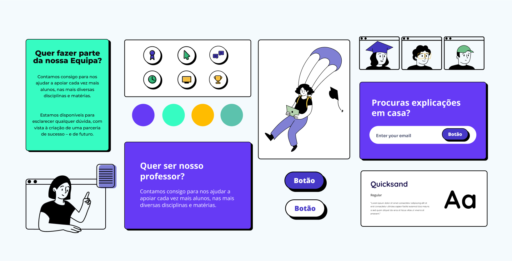
Aa

Quicksand

Thin - Regular - Semibold - Bold

Social Communication

Aa

Open Sans

Thin - Regular - Semibold - Bold

Headings

Aa

Montserrat

Thin - Regular - Semibold - Bold

Display

> The Approach

ExplicaOnline’s previous website featured inconsistent imagery and a lack of adaptability, which failed to captivate its visitors. To double their reach, we aimed to improve and modernize these features while educating their audience about the services and encouraging students, parents, and teachers to try it first.

To comprehend the diverse needs of our users, we initiated a meticulous content audit, evaluating existing educational materials and resources.

> Web Design

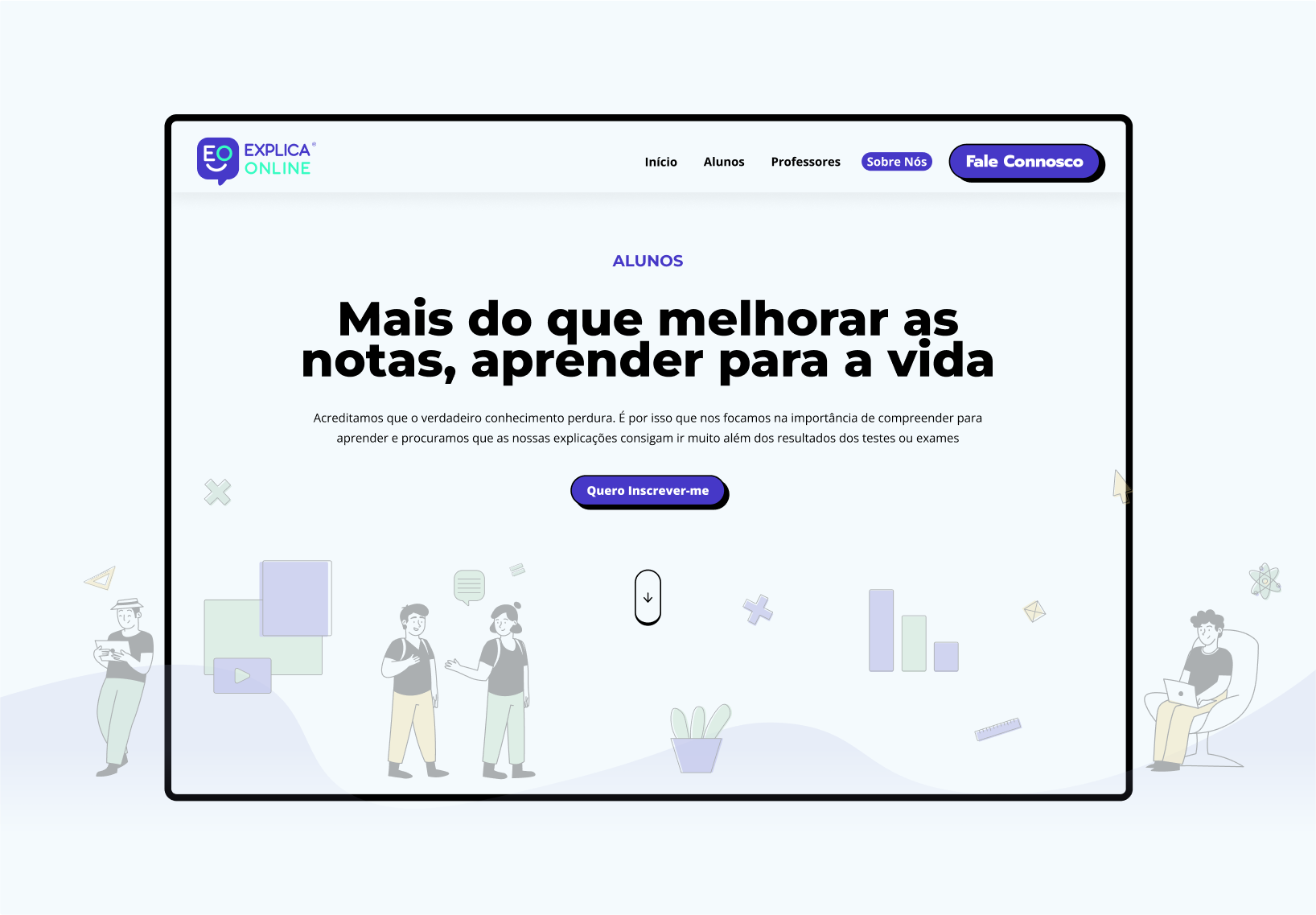
Conducting user testing at multiple stages via Hotjar-based heatmaps and session recordings helped validate design choices and incorporate valuable feedback.

Userflow and engagement also helped us create a compelling online experience via clear and logical pathways, reduced friction points, and strategically placing calls-to-action. The result was a seamless and user-friendly experience.
Previous slide
Next slide

> Conclusion and Impact

This project was an opportunity to spotlight the diverse angles of the digital educational journey. From the research to implementation of low-code development, we're proud that the brand has now established a robust foundation for its clients and customers. More than a website, ExplicaOnline emerges as a dynamic space where education transcends conventional boundaries, fostering inclusivity and joy for learners of all backgrounds.

Always one step ahead, we’re now optimizing the User experience by collecting their impactful insights in web surveys and forms.

> Testimonial

Susana Soares

ExplicaOnline mission is to be the bridge between students and teachers, providing an easy and reliable way to find and meet with a teacher virtually to receive support on any subject at any time. The overarching goal was to create an online platform that would provide high-quality educational resources and engage learners effectively.

Let's work together.

Send us a message and we will contact you as soon as possible.

Let’s Talk!

We’d love to hear from you
.

Join us!

We’d love to get to know you.
.